Friday 13 November 2009

1. In what ways does your media product use, develop or challenge forms and conventions of real media products? (i.e. of film openings)


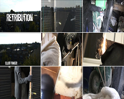
This is our contact sheet for our opening sequence. The first frame is of our main title. We decided to have the main title at this point as it enters dramatically. This is because the music changes and gets louder, also the picture changes from black to the panning shot. We chose the title ‘Retribution’ meaning “punishment that is considered to be morally right and fully deserved”. This title would be typical of an action thriller.


The second frame we chose is of the setting. It is a fade between the building and the skyline panning shot. It has an urban feel and suggest industrial trading. The purpose of the the purpose of the building is to show that the opening is set in a run down, secluded area. These types of shots are typical of openings as they put the audience in the right frame of mind for the film.


The third frame is to represent our costumes and props. It is of the petrol being poured over the hostage character. It shows the murderer character in a suit costume and the gerry can which is being used to poor petrol on the victim. We put our murderer character in a suit as it makes him look more important and higher up to the hostage. It is also a typical thing for openings to do because it helps the audience to understand who is who.


The fourth frame is to show our font. The font that we chose was called ‘Dirty Ego’. We found it on www.dafont.com. We chose this font because the style of the font looks rough, dirty and it has a stencil like appearance.


The fifth is to show genre and how our opening suggests it. We used this frame as it shows the genre well because it includes the violence and crime with the bat and also the different characters. We were aiming for a british crime/thriller so this frame is a good representation of this genre.


The sixth frame we used is to show how our opening sets up the story for the rest of the film. This frame has the character lighting a stick which he then throws onto the petrol which gives the impression of setting the hostage on fire. In this shot you don’t actually see the fire being lit but you hear the stick being thrown onto the petrol soaked ground. The way which this holds the suspense and ends on a cliff hanger is typical of our genre because it gets the viewer excited.


Our seventh frame is to illustrate how the characters are introduced. We think this frame does this well as it shows the hostage in the background as well as the other character in the foreground.


The eighth frame is of a shadow of the hostage being hit with a bat. This is to show our ideas for camera work. This is one of the shots that we are most pleased with as it is a less common shot and is more imaginative. We used a shadow because it keeps the mystery and doesn’t show the characters faces. This is to build up more tension and atmosphere. It is typical of openings to not give too much away as this can make the rest of the film boring.


Our final frame is a close up of the petrol being poured on the hostage. We chose this frame to represent special effects as the petrol in the shot is actually just water. We only used live action effects in our opening. This is typical of british crime films as guns etc. do not appear in real british crime.


2. how does your media product represent particular social groups?


i chose the hit-man from the film "hit-man" as the two characters are similar. there job is to kill and they both wear the same "uniform". they both wear suits which hides there job as people who wear suits are generally businessmen. they both seek revenge for something in our film you do not know.

3. What kind of media institution might distribute your media product and why?

4. Who would be the audience for your media product?

http://openclipart.org/people/ericlemerdy/ericlemerdy_man.png

this is harry, he is a man in his twenties. he has a 9 to 5 job that he feels it is at a dead end. he needs excitement in his life and he turns to film to escape from reality. he likes action films with crime, violence and a degree of drugs. he has never witnessed these things in reality so by watching films he feels part of the action. harry has a nice sized flat that he shares, wears nice clothes. even though his job is boring it is paid above average. he has a large DVD collection and has the latest games for his console. he has a nice car with all the latest tune pumping out of his 16ch speakers. he spends his money on what ever he wants.

5. How did you attract/address your audience?


this is the final opening with anitation

6. What have you learnt about technologies from the process of constructing this product?


7. Looking back at your preliminary task (the continuity editing task), what do you feel you have learnt in the progression from it to full product?

While doing the preliminary task we learnt a lot about the different camera and editing techniques. We have tried to use these properly and efficiently in our production. However in our opening we didn’t have any dialog so it was not necessary to use these techniques. Our opening was more about establishing a location and creating the right atmosphere for the rest of the film.

film category


What does the ‘15’ symbol mean?

No-one under 15 is allowed to see a ‘15’ film at the cinema or buy/rent a ‘15’ rated DVD or video game. Parents are warned that ‘15’ rated works are not suitable for children under 15 years of age.


after reading the BBFC's categories of film age rating we think our film "Retribution" is a 15. There is a scene of moderate violence but it is shown in a suggestive was and not direct. the film could have swearing later in the film as the characters are "common" and gangsters. the category description of 15 rating fits to our interpretation of the rest of the film.

Sunday 8 November 2009

retribution final

http://vimeo.com/moogaloop.swf?clip_id=7478007&server=vimeo.com&show_title=1&show_byline=1&show_portrait=0&color=&fullscreen=1" />http://vimeo.com/moogaloop.swf?clip_id=7478007&server=vimeo.com&show_title=1&show_byline=1&show_portrait=0&color=&fullscreen=1" type="application/x-shockwave-flash" allowfullscreen="true" allowscriptaccess="always" width="400" height="300">

http://vimeo.com/7478007">L3 OPENING SEQUENCE - GROUP 9 - FINAL VIDEO from cmdiploma on

Wednesday 4 November 2009

tilly and ysmin feedback

creative risk

the creative risk m group took was to film a different shot that wasn't  intended. while filming a shot, we noticed the shadow on the wall and decided to film the shadow of the action as it makes the audience think more using there imagination. it also reduces the violence in the first scene. 


the benefits of the shot was that it made the scene more interesting and it reduced the violence in the film opening.
if we where to re-film the shot we would probably  change the camera angle.

Monday 2 November 2009

Wednesday 28 October 2009

tilly and yasmin feedback

I think the strengths of this video are the still frame of the different stereo types with pictures and a short description. I also like the way that it is written on paper to show that these stereo types especially exist in schools. The fault i would change is some of the cuts look strange when it goes from the white stills to the video. I think this is because the still images only take up half the screen so the cross dissolve only takes up half the screen and the other half just fades in from black. a weakness is that the stereotypes do not stay on screen long enough for you to read. Also because they've had to lower the quality so that the video can be streamed online it's hard to read the writing. also there isn't any titles on the film.

Sunday 18 October 2009

i chose this shot of American gangster as it has allot of similarities to my opening sequence. The theme of the opening is the same (the gangster is being repaid with the persons life) this is why we called the film retribution meaning to repay. I also chose this picture as it captures the gas can, the gangster and the hostage this is also similar to my scene. Denzel Washington also uses a gun to murder the hostage but in my opening the gangster uses a bat. But the idea of using a weapon to show power of the character is the same.

Thursday 15 October 2009

Monday 12 October 2009

Sunday 11 October 2009

Feedback

No sign of the homework

Thursday 8 October 2009

this is my ident. i liked the idea of a card flying towards the screen and i called my logo a.c.e media productions after the ace of spade card that is in the ident. i used final cut to make the ident and photo shop to make the card.

Tuesday 6 October 2009


We made this contact sheet in photoshop using images that we found on images.google.com which we thought represented the ideas that we had in our heads. The font is one which we downloaded on dadfont.com when we were making our font board. We changed some of the images to black and white to make them look more atmospheric and also changed the brightness and contrast.

our idea

our opening sequence is going to be a action, gangster thriller. the scene will start with a man tied to a chair. he will have the appearance that he has been beaten up and brought to the location unwillingly. There will be freeze frames on the characters with titles.

Sunday 4 October 2009

feedback

A good set of posts, Louis.


The fonts we chose are all very edgy, dark and distorted and this is why we chose them. i feel that they go with the feel of our idea.


The Pictures we chose are to represent the setting and atmosphere of our opening.

pitch 4 - the unknown (animated feature, adult audience, based on fictional novel)

a unknown creature emerges from the grown in a small town in America. after being cloned in government labs to find out more about this strange creature the clones bread out of control and set destruction to human existence and the world arm themselves and fight back.

pitch 3 - front line (regional film)

set in the 80's, a cocky 16 year old teenager called Danny Johnson goes to a football match which changes his life forever. after the game Danny finds himself in the front lines of a raging football hooligan scrap. addicted to the buzz of fighting Danny goes on to become one of the most well known hooligans of the time. this was his downfall. matters get personal leading to close encounters to his family. trying to flee from this horrific lifestyle but will he ever escape.

pitch 2 - sure brothers (supernatural thriller)

set in the historical city of Moscow two young brothers seek the reasons for there mothers disappearance. when all hope is lost they receive help from a holy man who tells the brothers he can help them. the holy mans interference brings Satan into there path but will both brothers stay on the good side or join the devil in an attempt to free his mother.

pitch 1 TT. fictional character

after recovering from a unknown life threatening disease tom tucker a 18 year old finds his recovery bring some changes to his body. with his new super powers comes a secret identity. he becomes known as TT and his reasons to fight crime are of a tragic murder of his parent in his childhood.

preliminary task


i feel me, tilly, sophie and jahmal worked well together. me and tilly were on screen. sophie was on camera with jahmal. sophie did a great job with the camera, jahmal timed us in and tilly made the work surface shine (and makes a great cup of tea).

we used each camera rule well i think the rule we used most efectivly was the match on action.

i think me and tilly edited our periminary well. we got the timing write of the shot changes and used the 180 degree rule well.

what is continuity editing, match on action, a reverse shot and the 180 degree rule

continuity editing.


Continuity editing is the predominant style of editing in narrative cinema and television. The purpose of continuity editing is to smooth over the inherent discontinuity of the editing process and to establish a logical coherence between shots.


match on action.


A continuity cut which unites two different views of the same action together at the same moment in the movement, making it seems to continue.


shot/reverse shot.


Shot reverse shot is a film technique wherein one character is shown looking at another character (often off-screen), and then the other character is shown looking "back" at the first character. Since the characters are shown facing in opposite directions, the viewer assumes that they are looking at each other.


180 degree rule.


The 180° rule is a basic guideline in film making that states that two characters (or other elements) in the same scene should always have the same left/right relationship to each other. If the camera passes over the imaginary axis connecting the two subjects, it is called crossing the line. The new shot, from the opposite side, is known as a reverse angle.


Friday 2 October 2009

credits for opening sequence

a Invisible production presents
an a.c.e film
cast
tom stevens
louis peters
elliot fraser
costume design by tilly murr
art direction by yasmin wright
prodction by design steven holloway
casting by boris north
film editing by sarah jenkins
cinematography peter williams
original music by hannah thompson
Produced by bill ditton
Directed by Scott Wordell

MAINTITLE

Monday 28 September 2009

Feedback

Some good points Louis, but not all the tasks were done- screengrabs?

Sunday 27 September 2009


I chose football factory as it gives you a feel to what the film is about. the fast music sets a feeling of action and violence. the credits start with the production companies (vertigo films, rock star games) the directory nick love, then it tells you the main characters ( Danny dyer, frank Harper, tamer Hassan, Roland manookian, Neil maskell, Dudley Sutton and Jamie foreman. it then includes the casting director (Sam chandley. it then lists make-up hair stylists, costume designer, composer, music supervisor. then the editor, product designer, director of photography, executive producer, then it tells you the film is based on the book "football factory" by john king, then the writer and director (nick love). I also chose this film as it has very affective narration. Danny dyer the main character tells his story through out the film. I also love the camera angles and changes in the opening scene, Cutting from the credits to Tommy Johnson (Danny dyer) lying helplessly on the floor . After the narration it then cuts back in time 3 weeks in the past. The film then loops back to the beginning of the film. There are many sound which help the scenes seem more real. There are also a lot of affects been added to some scenes in editing for example the CCTV camera and the black and white cartoon style police man.

juno exercise

first we went into the classroom and was split into groups of four. we started off by watching the Juno opening on the laptops. then we had to storyboard the opening as we watched it through. my storyboard was very rough and caused a few laughs in my group. we then where told we were going to be filming our storyboard. unfortunately I was ill the day that we where filming so I do not know what happened. I was back to do the editing on Tuesday. we where split into pairs to edit the film. I was with angelica. we both contributed to the editing evenly and I think we worked well together. we tried as best as we could to keep the film in time with the music as it did in the original Juno. the main tool we used on final cut was the in out tool. this allows you to cut points of the film easily and drag it into place on the timeline. It was quite difficult to keep our film in time with the Juno film as our scenes were shorter than each scene from the Juno original. Our edited film looked different from the original as we couldn’t get the same camera angles and also we didn’t have the same camera effects. I am pleased with the end product even though we could have added credits and an affect to make it look a bit more like the Juno opening. The group worded well together , Each person contributing to the hole project playing there role within the group. If I was to change anything it would be how long each scene was as it was a push to make the opening the correct length . To make the video the right length we had to slow down some scenes this made the video look very strange in places as yasmine (our Juno) was walking in slow motion.

juno

Monday 21 September 2009

Feedback update

Much better- good level of detail. For the student example, you really need to look at some film openings made by students for their AS projects, so it is worth having a look through longroadmedia blogs to see the techniques they use.

Pete

student film.

after trying a range of searches i found this video...


the video is called Media Project : Lily Allen - Littlest Things. i found the short film very interesting and some parts quite funny.

strengths.

immediately at the start of the film it opens with an interesting camera view, its staring into a mirror where you can see passers by in it and also in written on the mirror its quotes "its whats on the outside that counts". most of the film seems to have been speed up but in some scenarios the camera has a really good affect where it goes into a slow motion affect. i really like how the man at the start of the film leads you toward the wall as you follows his journey then you ( the camera) stay there and you learn about the wall. the post office wall has great significance throughout the film. this is where things happen good and bad. e.g. the electrician fixing the electric box, the women vomiting, the men urinating (this adds humour to the sketch) and the couple canoodling. i like the camera affect when the two drunks stumble past as it gives a hazy, drunken, distorted view as if you were drunk. another thing that brings humour to the clip is that the wall seems to have feelings and it is being abused and no-one cares for it :(

some weaknesses are that some camera movements are a bit shaky. another small weakness is that the camera jolts slightly o the corner when it has cut back from a different shot.

film opening review.


I watch three film openings which were Sorority Row, Touch of Evil and lord of the rings. the film i chose was lord of the rings. i chose the lord of the rings film opening as i found that there were lots of interesting camera angles and it tells you the story behind the film. the film opening has many moods. the start of the opening begins with a dark screen with narration then the name of the film (lord of the rings)fades in through the darkness. it also plays music which sets a mood, the mood is relaxed but then moves into a more military style of music suggesting war. the camera then cuts to a battle field. there are some very interesting camera angles in the film opening, many of which are action shots. one particular shot i like is when the camera sweeps down from the cliff down into the battle action. the battling between the two sides is captured extremely well with many different angles. allot of the opening is computer graphically generated like the soldiers and the landscape.

Feedback

This blog will be the evidence of your research and planning for the AS coursework, so there needs to be lots on it and lots of detail to it.

All the tasks set will help build up this evidence, so if you don't complete them you will not be able to access the higher marks/grades.

You have not done the homework.

You also need for the post on Shifty, to say more about how the moodboard task worked and how it was based on a particular scene and trying to give a sense of atmosphere from that. Later you will be creating moodboards for your own project ideas.

You could do with a bit more detail in your post on how you used the technology (especially final Cut) Which tools did you learn to use?


Please complete the tasks set. I shall expect to be able to give you feedback on them tomorrow.

Pete

Thursday 17 September 2009

Postcard


i used photoshop to create this image. i used a few tools to create these effects. one of the tools i used was the curve tool. this enabled you to manipulate the colours of each picture. i also used simple tools like the the rubber tool and the magic wand tool to delete unwanted parts of the images. i used the text tool to insert some text. i rasterized the text to turn it into a graphic. then re-coloured the text.

Wednesday 16 September 2009

my first video using final cut


tuesday was the first time i have used final cut express. i have used other editing programs before so i had a vague idea of some of the tools i learnt allot of new things as well. such as the credit tool (being able to move the text around the screen). i learnt how to fade using in this program and how to overlap two different clips.

Tuesday 15 September 2009

mood board

this mood board was made for the film shifty.
the mood board has many connotations to represent different aspects of the film.

Saturday 5 September 2009